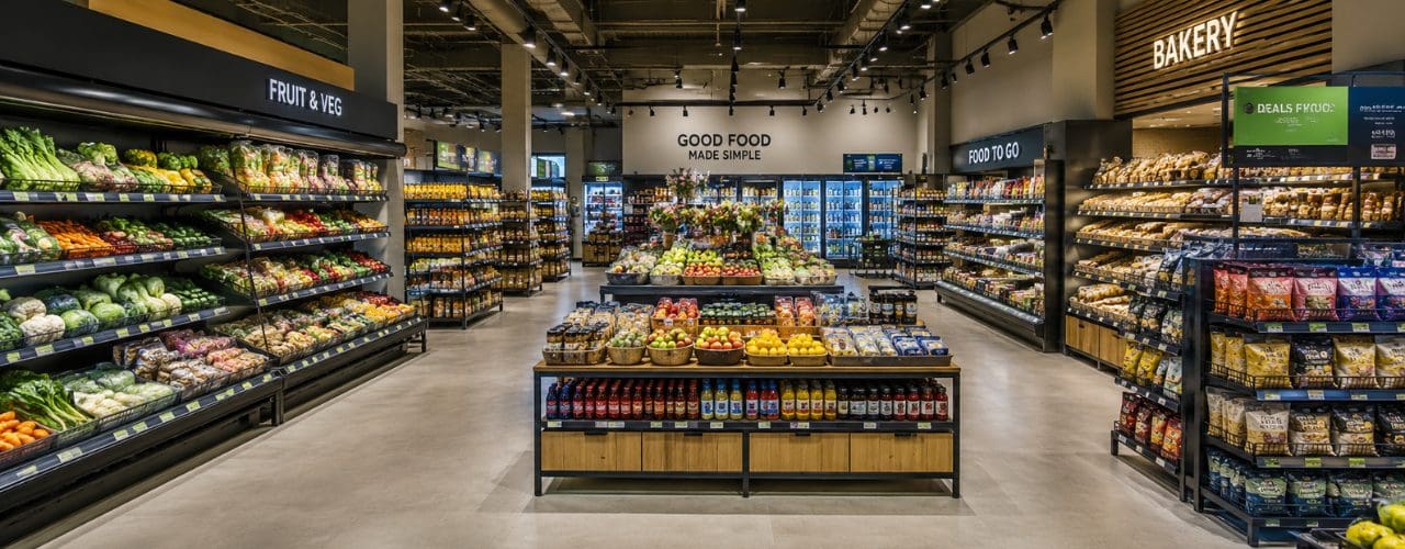
A smaller grocery store still needs to support planned shops, quick visits and service-led tasks. It also needs enough range and visibility to give customers confidence in the offer. Adding more fixtures can reduce circulation and make the store harder to understand.
Effective supermarket design starts by deciding which customer missions and categories deserve space. The layout should help customers complete their visit and give store teams a practical environment to operate.
M Worldwide’s Hagkaup case study provides a useful example. The flagship organised the offer into four shopping worlds and rationalised the store space by 50 per cent. The case study reports that sales remained equal to those of the original larger footprint.
How can a smaller grocery store use space more productively?
A smaller store can use space more productively by planning around customer missions, giving priority categories clear visibility and integrating services into the main journey. The format also needs a controlled approach to local ranges and a communication system that helps customers make decisions.
The following five moves give format and operations teams a practical starting point.
1. Organise the layout around customer missions
Departmental structures can reflect internal ownership without matching the way customers shop. A weekly shop, a meal for the same day and an online collection involve different routes and time expectations.
Map the main missions before setting the layout. Record the products, services and decision points involved in each visit. Then test where routes conflict or add unnecessary movement.
A mission-led plan may connect food for now with quick payment. It may group meal components so customers can complete a decision in one area. Collection customers may need a direct route that avoids the main queue.
Review route length, assistance requests and task completion for each mission. These measures can show where the plan supports the visit and where customers still need help.
2. Give priority categories clear visibility
A smaller footprint needs a clear category hierarchy. Equal visual emphasis can make the range feel difficult to read and reduce the impact of the products that define the proposition.
Choose the categories that create a reason to visit or influence perception of the whole store. The answer may include fresh food, bakery, prepared meals or a specialist local range.
Customers should understand those priorities early in the journey. Use sightlines and clear spatial markers to show where the main offer sits. Lighting and communications can reinforce the hierarchy when they support the same message.
Review visibility from the entrance, main junctions and service points. Observation can identify displays that block views or areas that customers miss.
3. Set a clear communication hierarchy
Smaller formats can create visual pressure because navigation, promotions and service instructions appear within a shorter field of view. A clear hierarchy helps customers recognise each type of message.
Place directional information at decision points. Keep category names consistent and use detailed product content where customers stop to compare. Remove messages that repeat information or ask for no clear action.
Fixture planning should follow the same logic. Routine categories may support faster selection. A specialist range may need space for comparison or advice.
Test the system with real tasks. Ask customers to locate an item, compare options and find a service point. Record where they pause or ask for help. Good supermarket design uses that evidence to improve the layout and communication together.
4. Integrate collection, self-service and support
Many stores added collection and self-service after they established the original format. This can create isolated zones and unclear handovers.
Plan these functions as part of the full journey. Collection customers need a direct route and clear status information. Self-service users need visible support for age checks or system problems. Customers who need advice should see where to ask for it.
The layout must also support staff movement, storage and back-of-house access. Review demand at different trading periods because a service point that works in a quiet hour may create congestion during an evening peak.
Queue time, transaction failures and staff interventions can help teams assess the service area after launch.
5. Define how the format can respond locally
A smaller store needs a consistent core and selected areas that can respond to local demand. M Worldwide’s Morrisons case study describes a Format Flex approach that adjusted services and ranges according to local needs. The example shows how supermarket design can support local relevance within a consistent operating framework.
The project created perimeter destination zones for locally relevant hero categories, including Market Street and M Cafe. It also allocated space to ranges such as Nutmeg, Morrisons Home and connected family categories.
Start by defining the elements that remain consistent, such as the customer promise, navigation logic and service standards. Then identify the ranges or services that each location can adjust.
Local flexibility needs clear ownership and display rules. Those controls help the store respond to demand without weakening the overall experience.
What should smaller supermarket formats avoid?
Higher density can narrow routes, reduce sightlines and add replenishment effort. Apply space reductions according to category role instead of cutting every area by the same proportion.
Technology cannot resolve an unclear customer journey on its own. Screens, kiosks and apps need a defined purpose, clear instructions and access to staff support.
Teams should also avoid adding local ranges without a process for selection and maintenance. Poorly managed flexibility can create inconsistency and make the store harder to shop.
Frequently asked questions
What makes small-format supermarket design effective?
Effective supermarket design gives customers a clear reason to visit and supports the main shopping missions. It prioritises the categories that define the offer and integrates service areas with daily operations.
How can supermarkets improve sales per square metre?
Allocate space according to demand and category role, then review product visibility and task completion. Sales data should sit alongside customer observation and operational feedback.
How should a supermarket plan customer flow?
Map the main missions and review the routes, decision points and service handovers involved in each one. Test the plan during busy periods and adjust areas that create congestion or repeated assistance.
Can a smaller store retain local choice?
Yes. A format can protect a consistent core and assign selected areas to local products or services. Clear rules help each store adapt while maintaining the brand and operating standards.
Use space according to the customer and commercial role
A smaller store can perform well when the proposition, journey and operating model support each other. M Worldwide combines customer research, environmental design and customer experience design to help grocery teams develop practical formats.
Speak to M Worldwide about reviewing supermarket design, customer flow and space allocation across a single store or a wider estate.